

Tenez Romans

Tenez Italics


Tenez, a Grand Slam serif typeface from Plau
We designed Tenez for one of Plau’s branding projects, further developing the resulting logotype into a typeface we felt could solve many designers’ needs.
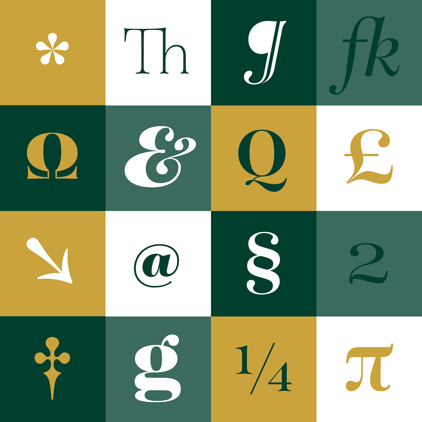
Its origins are rooted in pointed nib calligraphy which can be seen in contemporary Didot and Bodoni inspired typefaces. But Tenez’s shapes are organic (these modern typefaces were originally cut by hand after all) – in fact that was the challenge we set from the start: to make a typeface as organic in construction as possible.
Its style echoes some of late 19th century typefaces for billboards and advertising, yet we thought of it for contemporary uses.
One of the several unique features of Tenez is its unusual Thin weight, in which the contrast between thin strokes and the black area left by the serifs makes for a typewriter-like personality. The italics look really elegant and provide a perfect counterpoint to the roman weights.
Tenez was unapologetically conceived as a display typeface meant to be used large as in magazine openings, drop caps or everywhere there’s a need for elegant impact.
The family includes support for almost all Latin languages available, figure sets for almost every conceivable occasion (tables, text, you name it), alternates for the quirky beautiful R (sometimes simpler is better, but not always!) and Q (with a nice big tail for that article opener).
Tenez pairs really well with our no-frills sans-serif Motiva Sans and our cute vertical connected script Primot.
Typeface Design
Rodrigo Saiani
Graphic Design
Lucas Campoi, Flora de Carvalho, Dominique Kronemberger, Daniel Rocha, Gabriel Galc & Rodrigo Saiani.
Risography posters
Risotrip Printshop
Webspecimen Code
Mamangava, Poema
